Digital Architecture
Over Decoration.
We treat every website as a structure for human interaction. The foundation is invisible: grids that breathe, hierarchy that guides, and negative space that builds trust. In Bogotá, we see architecture everywhere—from the rigid lines of new skyscrapers to the adaptive reuse of colonial brick. That mindset travels into our digital work.
A beautiful interface that confuses a user is a failed building. We obsess over the blueprint before a single pixel is colored. Is the navigation a corridor or a maze? Does the call-to-action stand like a doorway or hide in the shadows? These are the questions of architects, not decorators.
"A website is a building for ideas; we pour the concrete and frame the light."


From Confusion to Clarity
The client had a superior product but a digital storefront that hid it. The "Add to Cart" button was three scrolls down on mobile, lost in a carousel of low-res images. The cognitive load was immense.
The Decision Lens
Criteria for Success:
- Optimized For: Mobile conversion speed.
- Sacrificed: The "hero carousel" (choice paralysis).
- Assumption: Users prefer clarity over endless visual variety.
We anchored the palette in the earthy tones of roasted beans—a warm charcoal and cream—which did more than look good; it grounded the brand identity. We compressed the purchase flow to a single, frictionless page.

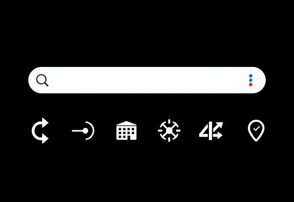
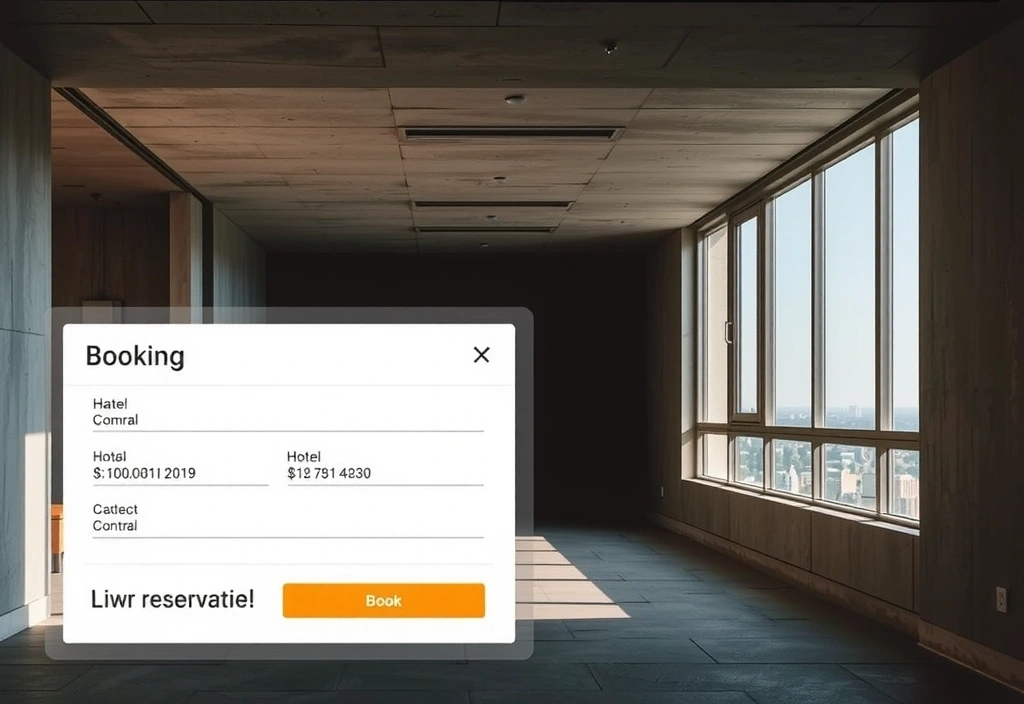
Micro-Craft
Fragments from fintech, hospitality, and creative stacks.
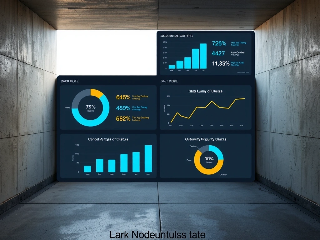 Fintech Dashboard
 Nav
Nav
 Card
Card
 Typography Hierarchy
 User
User
The 'Before' State:
Common Diagnostics.
The 'Everything' Menu
When a client insists on linking to every service, blog post, and 'About Us' subsection in the main nav. Result: Decision paralysis and high bounce rates.
"A potential customer lands on a site and cannot find a phone number or pricing within 15 seconds. They leave. Trust is lost."
We approach these inherited problems with empathy. Most businesses grow their websites organically, layering navigation without a blueprint. The result is digital clutter that actively repels customers. Our job is to diagnose the structural issues without judging the history.

From Calle 93B
To Your Market.
Our perspective is shaped by Bogotá—a city of constant adaptation. We bring that energy to every project, whether you're local or global. We don't just deliver files; we hand over the keys to a durable digital asset.